Main steps to build a website with Jekyll
- Use this Jekyll template to create a new project
- Publish the project on GitHub Pages
- Customize the
_config.ymlfile to set up your project details - Create pages
- Multimedia content and components
- Customize the layout and design
1. Use the Jekyll template to create a new project
├─ 🚀 Start the project using the template
│   ├─ 📥 Clone via “Import repository”
│   ├─ 🏷️ Rename the repo (e.g. g0-2025-website)
│   ├─ 👥 Invite collaborators
│   └─ 🖥️ (Optional) Local development with ruby installed:
│       ├─ 🔧 bundle install
│       └─ 👉 bundle exec jekyll serve → http://127.0.0.1:4000
You can start by cloning the Jekyll template repository for the Big Data Project Template.
Clone the repository
Go to the following link:
https://github.com/new/import
and paste the URL of the repository to clone:
https://github.com/danielefadda/master-projects-template-2025
give it a name based on your project, for example:
g0-2025-website
N.B. you had to substitute g0 with your group number.
Then, select the visibility of the repository (public or private) and click on “Create repository”. and click on “Import repository”.
Once the repository is cloned, you will find a folder structure similar to the following:
project-template/
│
├── _config.yml              # basic site settings
├── _data/
│   └── settings.yml         # visual config and textual content (customizable)
├── _pages/
│   ├── index.md             # homepage
│   ├── project.md           # project description
│   ├── team.md              # group members
│   └── deliverables.md      # results (PDF, poster, etc.)
├── assets/
│   └── img/                 # generic images (e.g. placeholder)
├── _includes/               # jekyll components
├── _layouts/                # html layouts
├── README.md
├── LICENSE
└── .github/workflows/      # (opt.) CI/CD for GitHub Pages
Invite your team members to the repository so they can collaborate on the project. You can do this by going to the repository settings on GitHub, clicking on “Manage access”, and inviting them by their GitHub username or email address.
Local development (optional)
This is an optional step, but if you want to develop the website locally, you need to install Jekyll on your computer. You can find the instructions on how to do it in the official guide or in our local development section.
For a quick reference we provide these instructions:
Once the repository is cloned, run:
bundle install
Then launch the site with the bundle command:
bundle exec jekyll serve
open your browser at http://127.0.0.1:4000
2. Publish the project on GitHub Pages [TO BE REVIEWED]
├─ 🌐 Publish with GitHub Pages
│   ├─ ⚙️ Go to Settings → Pages
│   ├─ 📂 Select branch + root directory
│   └─ 🚀 Site is live at https://<username>.github.io/<repo>/
To deploy your project on GitHub Pages, you can use the following steps:
- Go to the repository settings on GitHub.
- Scroll down to the “GitHub Pages” section.
- Select the branch you want to use for GitHub Pages (usually
mainorgh-pages). - Click “Save” to enable GitHub Pages.
- Your site will be published at
https://<username>.github.io/<repository-name>/.
Once you have enabled GitHub Pages, every time you push changes to the selected branch, your site will be automatically updated.
3. Customize the _config.yml file to set up your project details
├─ ⚙️ Customize `_config.yml`
│   ├─ 🏷️ baseurl, url, title, description
│   ├─ 🔗 github_repo (footer links)
│   ├─ 🧭 navbar → list of pages + SoBigData Master
│   └─ 🎨 skin + colors + Google Fonts
The _config.yml file contains the basic settings for your Jekyll site. You can customize it to set up your project details, such as the title, description, author, and other configurations. All the variables in the _config.yml file are used to generate the content of the site and can be accessed in the templates and pages using Liquid syntax. For example, you can use {{ site.title }} to access the title of the site. More details on how to edit the file can be found directly in the file itself, where you can find comments explaining each variable.
General settings
The first thing to do is to set the baseurl variable to the name of your repository, for example:
baseurl: "/g0-2025-website"
You had also to set the url variable to the URL of your GitHub Pages site, for example:
url: "https://<username>.github.io"
Then, you can customize the following variables: title, subtitle and description of the site
There are also some variables that can be used to customize the appearance of the site, such as github_repo. These variables are used to fill information about the repository in the footer of the site.
Navigation menu
You can customize the navigation menu by editing the navigation variable in the _config.yml file. This variable is a list of links that will be displayed in the navigation bar of the site. Each link is defined by a title and a url. You can also create submenus by using the children variable, which is a list of links that will be displayed as sub-items of the main link, for example:
navbar:
  style :  dual #don't change this, it is used to set the navbar style.
  brand: # this is the brand of the navbar, it will be displayed on the left side.
    title :  "SoBigData Master's projects Template"
    img: "./assets/images/Logo_masthead.png" # don't change this
    url: /
  nav:
    - title: Example page
      url: /example.html
    - title: Program
      url: /schedule.html
    - title: Social events
      url: /social.html
    - title: Markdown
      url: /markdown.html
    - title: Nested menu
      child:
        - title: SoBigData
          url: https://sobigdata.eu/
        - title: SoBigData RI
          url: https://sobigdata.eu/ri/
        - title: SoBigData ITA
          url: https://sobigdata.it/
    - title: SBD Master # this must be always the last item in the navbar, don't change it
      url: https://masterbigdata.it/
It’s quite easy to add new links or modify existing ones. Just follow the structure of the example above, and you can create a navigation menu that suits your project needs. Please note that the last item in the navbar must be the SoBigData Master link, as it is used to link to the main website of the SoBigData Master’s projects. Last but not least, check the responsiveness of the navbar, as it should work well on both desktop and mobile devices.
General appearence
After the navigation section, you can find the General appearence section, which contains variables that can be used to customize the appearance of the site. You can change the colors, fonts, and other visual aspects of the site. We discuss this in more detail in the custom layout section below.
4. Create pages
├─ 📄 Create and organize pages (`_pages/`)
│   ├─ 🏠 index.md
│   ├─ 📁 project.md
│   ├─ 👥 team.md
│   ├─ 📦 deliverables.md
│   └─ ✏️ Each file: front matter → layout, title, subtitle, vega, header_type, etc.
You can create pages in the _pages directory. Each page is a Markdown file with a .md extension. The name of the file will be used as the URL of the page. For example, if you create a file called about.md, it will be accessible at https://<username>.github.io/<repository-name>/about/.
big-data-project/
│
├── _pages/
│   ├── index.md
│   ├── article.md
│   ├── team.md
│   └── technical-report.md
├── ...
└── README.md
Front Matter
Each page should start with a YAML front matter block that defines the layout and other metadata for the page.
Front Matter is a section at the beginning of a file containing metadata about the file itself.
It is delimited by three dashes (---) and can include variables such as layout, title, subtitle, cover image, header type, etc.
This information is used to customize the page content. Variables in the Front Matter are accessible via Liquid variables within the file and are used in templates with the declaration ``
For example:
---
layout: default
title: "Home"
subtitle: "A template and a guide to develop your Big Data Project website"
...
---
Content
You can use headings, paragraphs, lists (and much more) to structure the content effectively. This can be done using Markdown syntax, which allows for easy formatting of text. For example, you can use bold or italic text to emphasize key points, and you can create lists to organize information clearly.
This is an example of how to format the text in a way that is visually appealing and easy to read. In this paragraph we use a .lead class to highlight the main points of the project.
You can write an entire page using only markdown syntax, but you can also use HTML tags to add more complex elements or not standard layout. In this example, we use a paragraph with a class .green to highlight the text in green color.
This theme is based on Bootstrap, so you can use all the Bootstrap classes to style your content. For example, you can use the .container class to create a responsive container, or the .row and .col-* classes to create a grid layout.
You can find more information about the Bootstrap classes at this page: Bootstrap Documentation.
5. Multimedia content and components
├─ 🎥 Multimedia content
│   ├─ 🖼️ **Images**
│   │     ├─ 📁 folder: assets/images/
│   │     ├─ 📝 use Markdown or `img` tag
│   │     └─ 🖼️ galleries via `masonry.html` + config
│   ├─ 🎬 **Videos**
│   │     └─ ▶️ embed YouTube using shortcode
│   ├─ 📷 **Icons**
│   │     └─ 🔍 use Font Awesome icons
│   ├─ 🖼️ **Modals**
│   │     └─ 🆕 use Bootstrap modals for pop-ups
│   └─ 📈 **Charts (Vega/Altair)**
│         ├─ 💾 save JSON in assets/charts/
│         ├─ ✅ include `vega: true` in front matter
│         └─ 🔗 shortcode `<vegachart schema-url=...>`
Images
You can add images to your pages using the html img tag. To add an image, you had to save the image in the assets/images directory and then use the img tag or the markdown syntax to embed it in the page. For example:

In this theme there are also some shortcodes that can be used to add images in a gallery format. Save the images in the subdirectory assets/images/gallery_one and then use the following syntax to embed them in the page:
{% include_cached snippets/masonry.html internal="gallery_one" %}
Image Gallery
<div class="container">
{% include_cached snippets/masonry.html internal="charts" %}
</div>
include_cached snippets/masonry.html indicates that the masonry.html file is included from the _includes/snippets directory. The internal parameter is used to specify the name of the subdirectory where the images are stored. In this case, the images are stored in the assets/images/thumb-charts directory.
Remember to include the assets/images/thumb-charts directory in the _config.yml file, so that the images are correctly displayed in the gallery. You can do this by adding the following line to the _config.yml file:
defaults:
  - scope:
      path: "assets/images/thumb-charts"
    values:
      image_col: charts
N.B. pay attention to the indentation of the yml file variables, as it is important for the correct functioning of the theme. If you are editing the website locally, restart the service to view changes made in _config.yml
Videos
You can include youtube video using the syntax above, where id is the ID of the video and provider is the name of the video provider (in this case, youtube). You can also use other providers such as vimeo or dailymotion. The video will be embedded in the page and will be responsive, adapting to the width of the container in which it is placed.
Icons
To insert icons, you can use Font Awesome.
<i class="fa-solid fa-pen-nib"></i> To add an icon to text, simply include the corresponding HTML code.
A pen
A code icon
A chart icon
Modals
You can also create modals to display additional content or information in a separate window without leaving the current page. Modals are a common UI pattern used to display content in a dialog box that overlays the main content of the page. This theme uses Bootstrap’s modal component, which provides a simple way to create modals with minimal code. To create a modal, you can use the following syntax:
<button type="button" class="btn btn-primary" data-toggle="modal" data-target="#exampleModal">
  Launch demo modal
</button>
<div class="modal fade" id="exampleModal" tabindex="-1" aria-labelledby="exampleModalLabel" aria-hidden="true">
  <div class="modal-dialog modal-dialog-centered">
    <div class="modal-content">
      <div class="modal-header">
        <h5 class="modal-title" id="exampleModalLabel">Modal title</h5>
        <button type="button" class="btn-close" data-bs-dismiss="modal" aria-label="Close"><span aria-hidden="true">×</span></button>
      </div>
      <div class="modal-body">
        This is the content of the modal. You can add any HTML content here, including images, text, and other elements.
        </div>
        <div class="modal-footer">
        <button type="button" class="btn btn-secondary" data-dismiss="modal">Close</button>
        </div>
    </div>
    </div>
</div>
A button is used to trigger the modal, and the data-toggle and data-target attributes are used to specify the modal to be opened. The modal itself is defined in a div with the class modal, and it contains a header, body, and footer. You can add any HTML content you want inside the modal body.
This is an alternative version using an image as a trigger for the same modal (same ID):
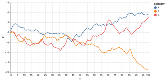
Charts
You can also add charts to your pages using the vegachart tag. To embed a chart you had to save the chart as a json file in the assets/charts directory and then use the vegachart tag to embed it in the page.
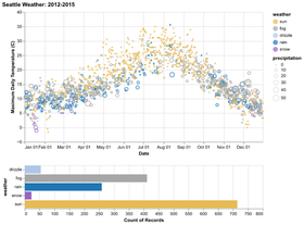
From Python to the Web
Altair is a data visualization library for Python, based on Vega and Vega-Lite. This means that Altair generates Vega-Lite specifications, which are then converted into Vega specifications and finally into charts viewable in a web browser. To embed an Altair chart in a web page, you need to convert the Vega-Lite specification into a JSON object and save it as a .json file.
The procedure in altair to save the Vega-Lite specification as a .json file is as follows:
Given any altair chart:
# Example data
data = pd.DataFrame({
    'a': ['A', 'B', 'C', 'D', 'E'],
    'b': [28, 55, 43, 91, 81]
})
If you want to make the chart responsive, when saving the .json file you can specify the property width='container'.
# Create the chart
chart = alt.Chart(data).mark_bar().encode(
    x='a:N',
    y='b:Q'
).properties(
    width='container',
    height=300
)

# Save the chart as a JSON file
chart_json = chart.to_json()
with open('chart.json', 'w') as f:
    f.write(chart_json)
The chart.json file can then be used in a web page to display the chart. To do this, you can use the Jekyll vegachart tag, specifying the path to the .json file as the value of the schema-url attribute.
<div style="height: 400px">
<vegachart schema-url="{{site.baseurl}}/assets/charts/chart_responsive.json" style="width: 100%; height: 100%"></vegachart>
</div>
This theme has been customized to support Vega charts without complications: if the page where you want to display the chart has vega: true in the front matter, the vegachart tag will be interpreted and the chart will be displayed correctly. vega: true is a variable that tells the page to load the Vega plugin. In this way, the chart will be displayed responsively, adapting to the width of the container in which it is placed.
Example of embedding a chart created with Altair
- The chart was saved as
chart_responsive.jsonand placed in theassets/chartsfolder. - If you try to display the chart in a web page without specifying the property
width='container', the chart will not be responsive and will be displayed with a fixed width. - If you try to display the chart in a Jupyter notebook, the chart will not be visible because the
width='container'property is not supported in that environment. In this case, you can specify a fixed width in pixels and change the width property only during export.
6. Customize the layout and design
├─ 🎨 Layout & design
│   ├─ 🎭 Choose skin (graymor, minty, lux…)
│   ├─ 🖌️ Customize colors via `chulapa-skin.vars`
│   ├─ 🆕 Add Google Fonts (e.g. Lekton)
│   ├─ 🛠️ Add custom CSS in assets/css/custom.scss
│   ├─ 🧩 Header types: hero, base, post, image, splash
│   ├─ 🧾 Navbar and footer via config and `_includes/`
│   └─ 🧱 Use helper CSS classes: `.full-width-wrapper`, `.lead`, `.green`, etc.
The theme provides several layouts that can be used to customize the appearance of your pages. You can choose the layout that best fits your content and use it in the front matter of your page.
Customizing the theme
To customize the general theme, you can modify the skin variable in the _config.yml file.
chulapa-skin:
  skin:  "graymor"
The list of available themes is as follows:
graymor, gitdev-dark, gitdev, universal, academia, gitdev, towards, pear, twitter-lights-out, twitter-dim, wandoo, lymcha, twitter, chulapa, sunset, sunset, minty, lux, journal, deeply.
You can further customize the selected skin by modifying the color variables in the _config.yml file.
chulapa-skin:
  vars:
    primary-color: "#ff0000"
    body-bg: "#fbf1ed"
variables are bootstrap variables that can be used to customize the appearance of the site. You can change the primary color, body background color, and other variables to match your project’s branding. A complete list of bootstrap customizable variables can be found at this link, while a complete list of the variables used in this theme can be found at this link.
Header Types
For example, you can use the hero layout to create a full-width header with a background image and a title:
layout: default
title: "Home"
vega: true
header_type: hero
header_img: assets/images/Jekyll_Logo.png
header_title: "Project Template"
subtitle: "A template and a guide to develop your Big Data Project website"
There are several header types available, such as base, post, hero, image, and splash. You can choose the one that best fits your content and use it in the front matter of your page.
Fonts
To import fonts different from the theme defaults using Google Fonts, you need to add a reference in the _config.yml file, which you can obtain from Google Fonts:
googlefonts:
  - url: "https://fonts.googleapis.com/css2?family=Lekton:ital,wght@0,400;0,700;1,400&display=swap"
To set the font across the entire site, add the variables in the _config.yml file:
chulapa-skin:
  vars:
    headings-font-family: "Lekton"
Finally, you can also use fonts in a more targeted way, for example within a single class.
Open the assets/css/custom.scss file to see how the .comic-neue-regular class was created, used in the following line:
<div class="comic-neue-regular" style="font-size: 20px; color:darkred">
  This is a test to check if I correctly imported the horrible font
  <span class="comic-neue-bold">Comic Neue</span>
</div>
Footer
The footer section is defined in the _includes/footer.html file. This section should not be modified directly.
Instead, update the _config.yml file with the correct information.
Specifically, update the following fields:
github_repo:
  - name: "Group 0 - Project repository"
    url: "https://github.com/sobigdata-master/progettone-template"
  - name: "Group 0 - Website repository"
    url: "https://github.com/sobigdata-master/progettone-template"
Once the fields are updated, edit the _data/members.yml file by adding the group members’ information.
Custom CSS
You can customize the layout and design of your site using CSS. The theme uses Bootstrap, so you can use all the Bootstrap classes to style your content. You can also create your own CSS classes in the assets/css/custom.scss file. For example, you can create a class called .comic-neue-regular to use a custom font:
.comic-neue-regular {
    font-family: 'Comic Neue', sans-serif;
    font-weight: 400;
}
.comic-neue-bold {
    font-family: 'Comic Neue', sans-serif;
    font-weight: 700;
}
You can then use this class in your HTML code to apply the custom font to specific elements:
<div class="comic-neue-regular">This is a test to see if I have correctly imported the horrible font <span class="comic-neue-bold">Comic Neue</span></div>
If you want to add a custom CSS to a specific page, you can use the {: .class-name } syntax at the end of the paragraph or element you want to style. For example, you can use the .lead class to highlight the main points of the project:
This is an example of how to format the text
{ : .lead }
The full-width-wrapper class
We create a special class to enlarge the width of a column: full-width-wrapper. You can use it to create a full-width section that spans the entire width of the page. To do this, you can wrap the content in a div with the class full-width-wrapper. For example:
<div class="full-width-wrapper">
    <img src="/prova_master/assets/images/header.svg" alt="sbd-pattern" class="full-width-image">
</div>
This will create a full-width section with the specified image. You can also use the full-width-wrapper class to create a full-width section with a background color or an image. For example:
Why use and don't use the `full-width-wrapper` class?
The full-width-wrapper class is useful when you want to create a section that spans the entire width of the page, such as a section divider or a full-width image. However, you should avoid using it for the whole page as it can lead to a less readable layout, especially on large screens and with a lot of text. Instead, use it for specific sections where you want to create a visual impact or highlight important content or insert a gallery of images or a chart with a lot of details that needs more space to be displayed correctly.
Recap tree
This is a synthetic overview of the steps seen in this guide:
💡 Guide: Building a website with Jekyll
│
├─ 1. 🚀 Start the project using the template
│   ├─ 📥 Clone via “Import repository”
│   ├─ 🏷️ Rename the repo (e.g. g0-2025-website)
│   ├─ 👥 Invite collaborators
│   └─ 🖥️ (Optional) Local development with ruby installed:
│       ├─ 🔧 bundle install
│       └─ 👉 bundle exec jekyll serve → http://127.0.0.1:4000
│
├─ 2. 🌐 Publish with GitHub Pages
│   ├─ ⚙️ Go to Settings → Pages
│   ├─ 📂 Select branch + root directory
│   └─ 🚀 Site is live at https://<username>.github.io/<repo>/
│
├─ 3. ⚙️ Customize `_config.yml`
│   ├─ 🏷️ baseurl, url, title, description
│   ├─ 🔗 github_repo (footer links)
│   ├─ 🧭 navbar → list of pages + SoBigData Master
│   └─ 🎨 skin + colors + Google Fonts
│
├─ 4. 📄 Create and organize pages (`_pages/`)
│   ├─ 🏠 index.md
│   ├─ 📁 project.md
│   ├─ 👥 team.md
│   ├─ 📦 deliverables.md
│   └─ ✏️ Each file: front matter → layout, title, subtitle, vega, header_type, etc.
│
├─ 5. 🎥 Multimedia content
│   ├─ 🖼️ **Images**
│   │     ├─ 📁 folder: assets/images/
│   │     ├─ 📝 use Markdown or `img` tag
│   │     └─ 🖼️ galleries via `masonry.html` + config
│   ├─ 🎬 **Videos**
│   │     └─ ▶️ embed YouTube using shortcode
│   ├─ 📷 **Icons**
│   │     └─ 🔍 use Font Awesome icons
│   ├─ 🖼️ **Modals**
│   │     └─ 🆕 use Bootstrap modals for pop-ups
│   └─ 📈 **Charts (Vega/Altair)**
│         ├─ 💾 save JSON in assets/charts/
│         ├─ ✅ include `vega: true` in front matter
│         └─ 🔗 shortcode `<vegachart schema-url=...>`
│
├─ 6. 🎨 Layout & design
│   ├─ 🎭 Choose skin (graymor, minty, lux…)
│   ├─ 🖌️ Customize colors via `chulapa-skin.vars`
│   ├─ 🆕 Add Google Fonts (e.g. Lekton)
│   ├─ 🛠️ Add custom CSS in assets/css/custom.scss
│   ├─ 🧩 Header types: hero, base, post, image, splash
│   ├─ 🧾 Navbar and footer via config and `_includes/`
│   └─ 🧱 Use helper CSS classes: `.full-width-wrapper`, `.lead`, `.green`, etc.
│
└─ ✅ Final checklist before release
    ├─ 🔒 Repo and baseurl are correct
    ├─ 📝 Front matter in all pages
    ├─ 🔗 Navbar/footer updated
    ├─ 👥 Team listed in `_data/members.yml`
    └─ 📂 Multimedia assets properly placed
This guide provides a comprehensive overview of how to create a website using Jekyll, from setting up the project to customizing the layout and design. By following these steps, you can create a professional-looking website for your Big Data project that is easy to maintain and update.